Data Discoveries
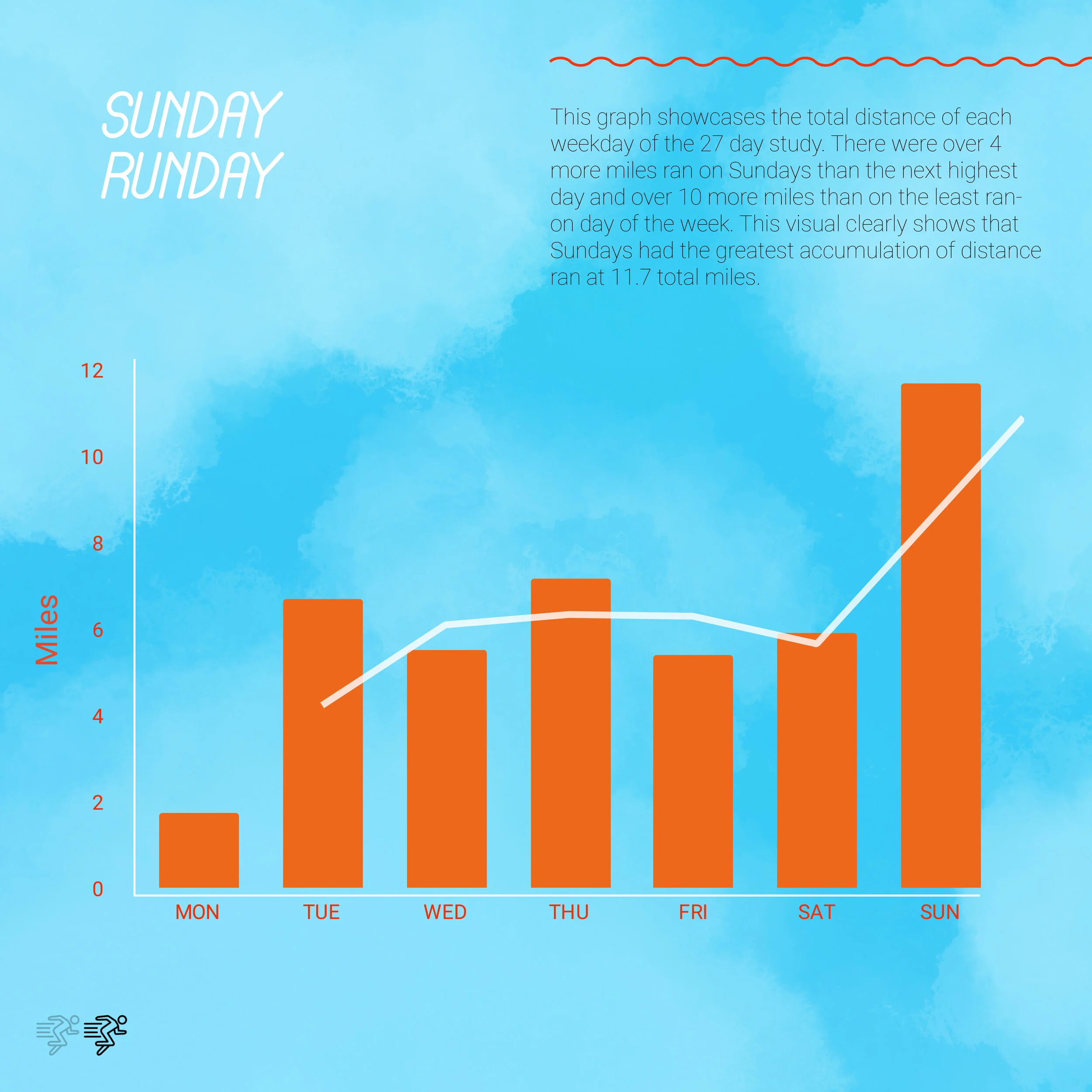
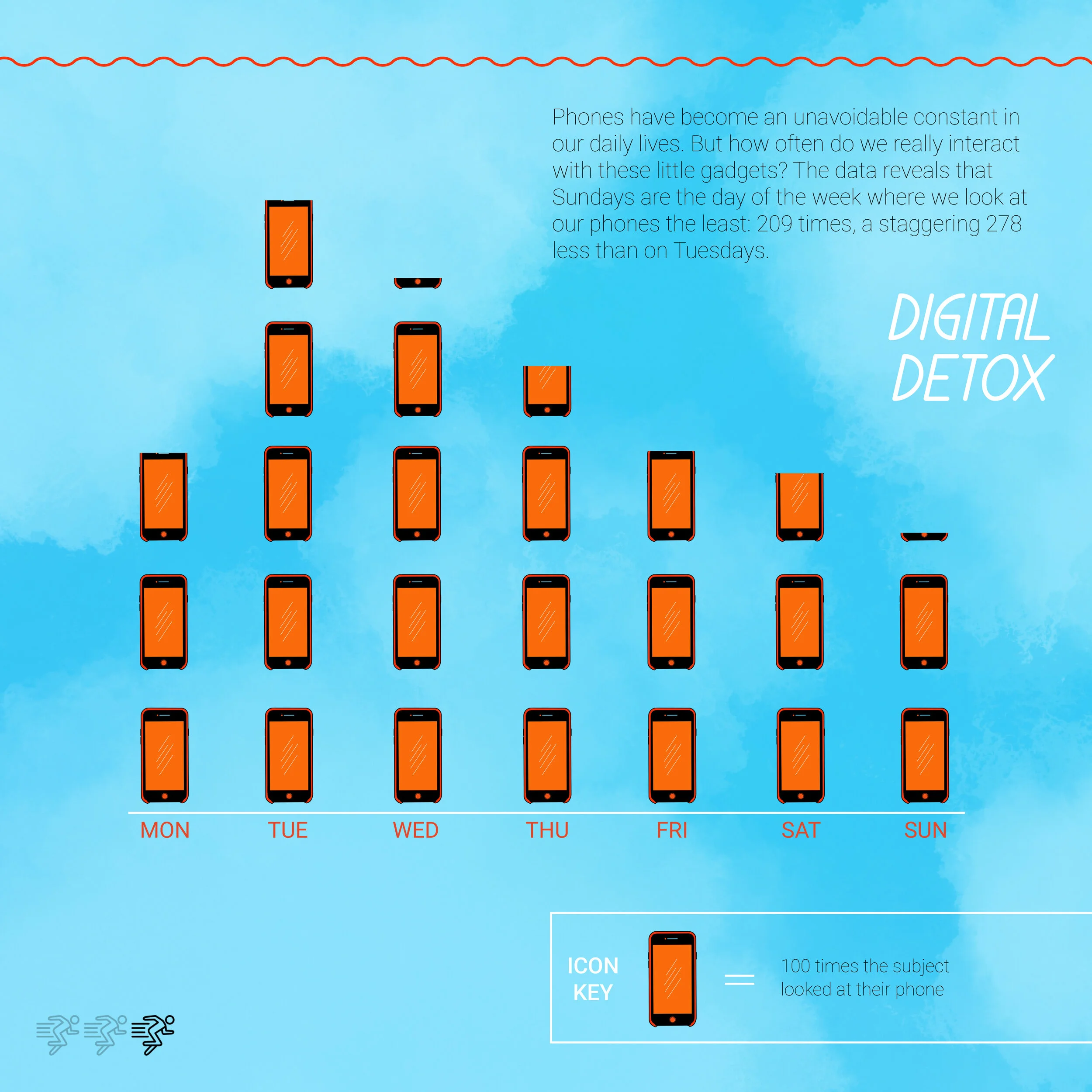
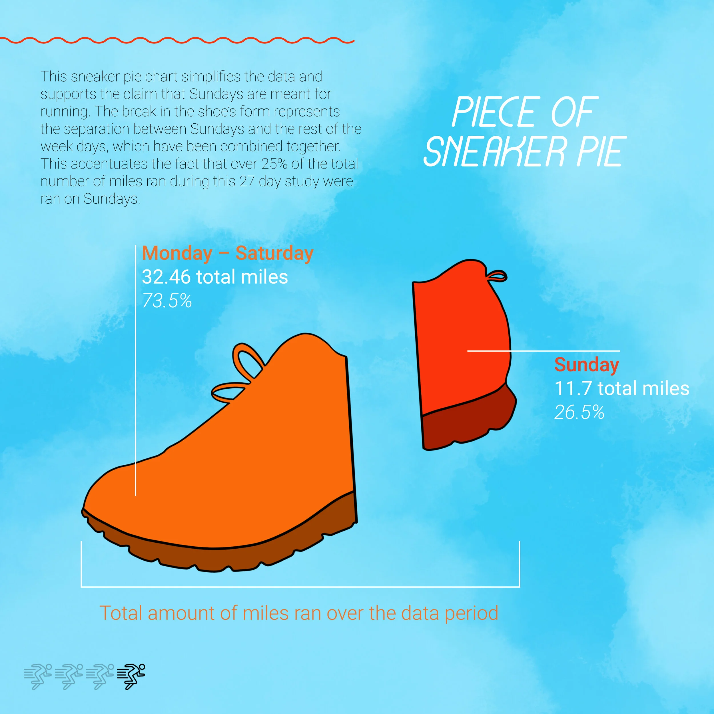
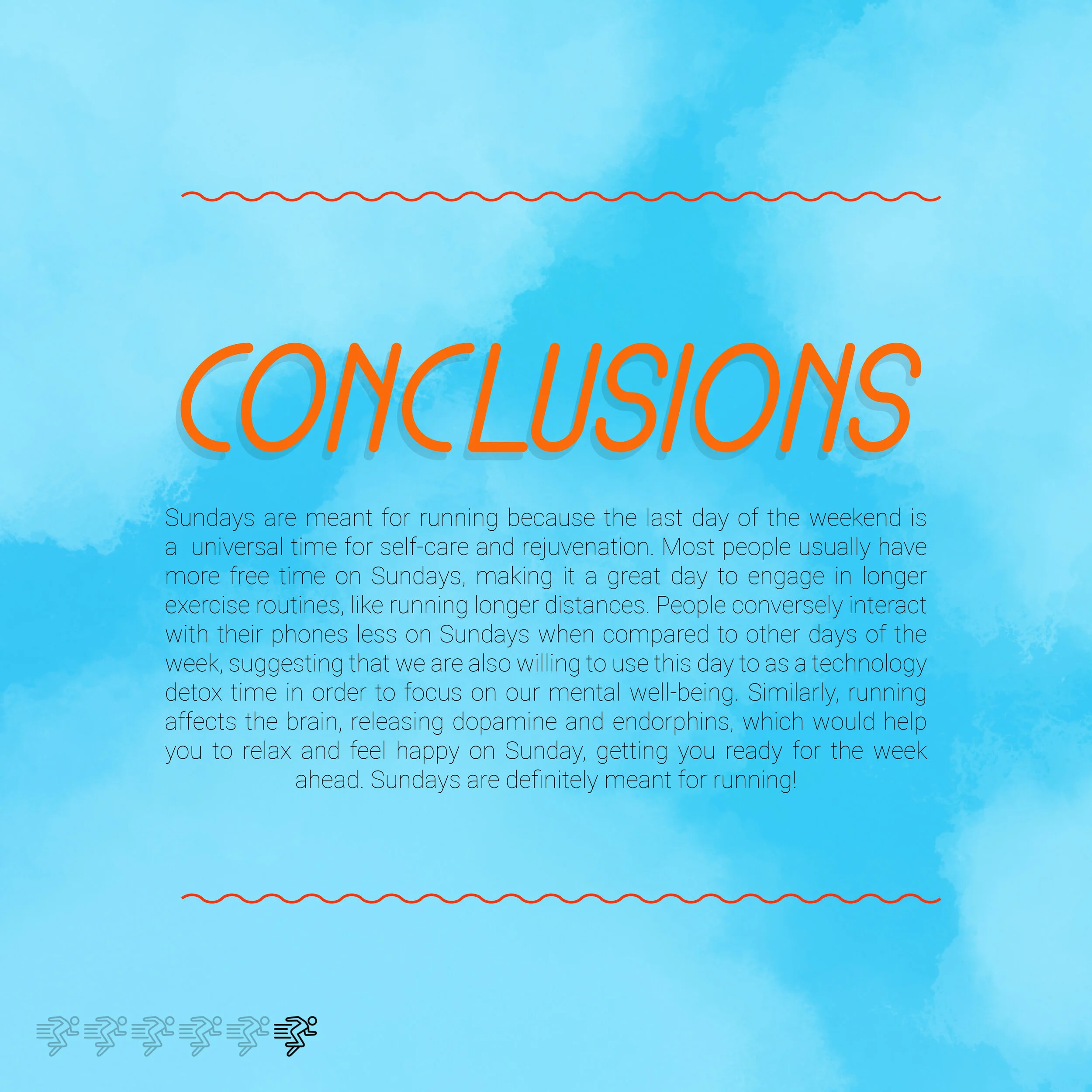
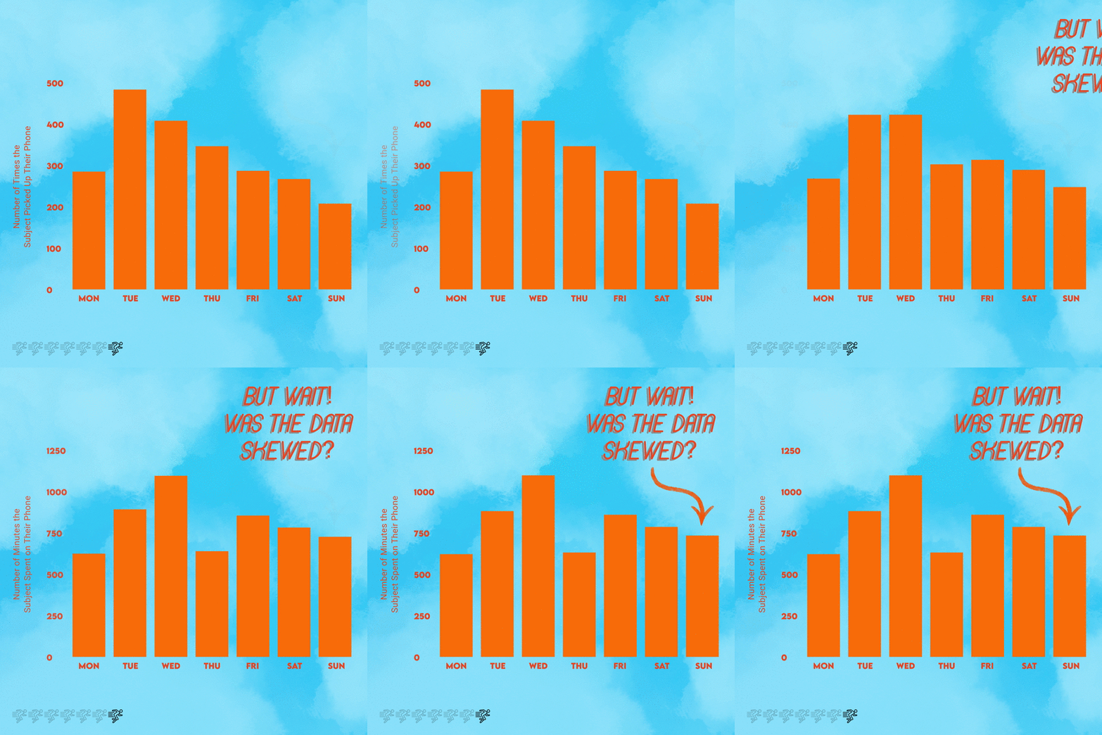
How does a designer take a random and completely uncontexualized data set and turn it into a compelling argument? The answer is with imagination and a great degree of manipulation. I was given a group of data points collected by a single individual which spanned 27 days and 5 categories: the number of times they looked at their phone, their phone usage in minutes, miles they ran, their weight, and the amount of money in their margin account. When I first received this data, I was hoping that a clear argument would jump out at me. Unfortunately, this was not the case. I moved columns around and tried to contextualize each category in different ways but nothing worked to make a conclusion clear. I realized that I would have to seriously highlight, crop, and modify the data given to me in order to reach a final argument. I first condensed the 27 dates and combine each category of data into the 7 days of the week which would help to create more easily digestible visualizations. Once I did this, I noticed that there were more miles ran on Sundays than on any other day of the week; this was a realization that I couldn’t ignore and ran with it. However, now came the difficult part of somehow crafting a story around this and using other categories to support my explanation of the data. I decided to completely drop the categories of weight, the money in the account, and the time they spent on their phone. I did decide to visualize the number of times the participant looked at their phone because there seemed to be a slight inverse relationship between this data category and miles ran. Then the idea of self care came to mind as something I could manipulate into the realm of Sunday because exercise and taking a break from digital devices are widely accepted forms of treating our bodies and minds with care.
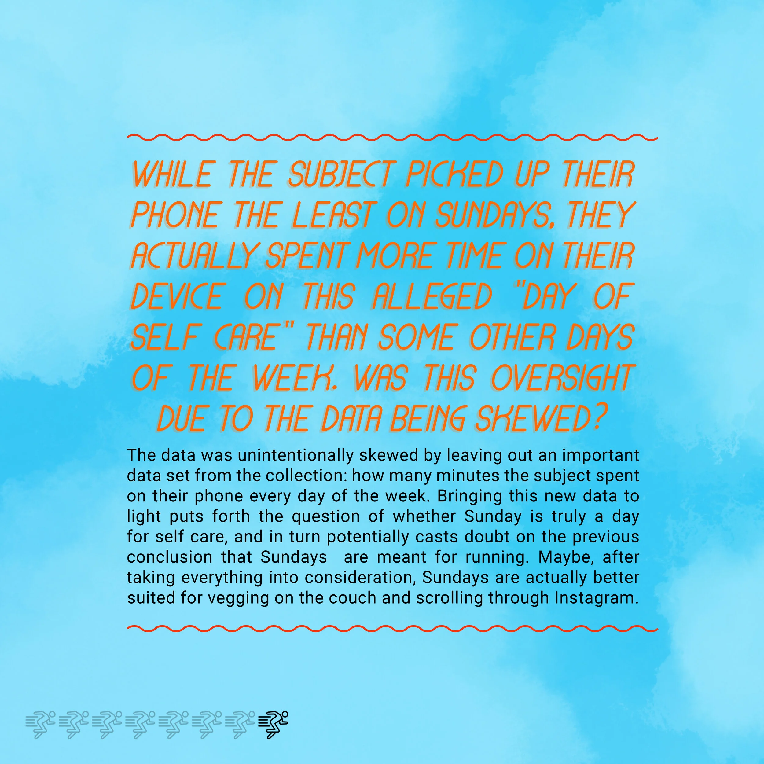
To present my findings in this time of isolation, I created a “poster” which included six separate images uploaded to my Instagram in the form of a carousel post. I went through quite a few ideations of the design for this instagram poster. I finally reached the conclusion that I needed to utilize bold colors, which would highlight the confidence I had in my conclusion, and simple yet eye-catching data visualizations which would help to lead the viewers eyes to only the parts of the data that wanted them to see. I made sure to use extremely confident wording in my copy which allows no room for doubt from readers. If I present my findings as fact by saying it’s fact multiple times and by showing graphs which support my conclusion, it is indeed fact, right? Wrong! After presenting my conclusions, I then went back to the original data and decided to take another look at the categories I had originally discarded to see if any of them could disprove my own argument. The amount of time the participant spent on their phone ended up doing just that. While half of my argument relied on the fact that this person picked up their phone less on Sundays, the data showed that they actually spent more time on their device on Sunday that some other days of the week, throwing a wrench in my argument that Sundays are a day for mental and physical self care. I went back to my original instagram poster design and created two more slides which featured this new disruptive category and new copy where I call my original “facts” about running and self care into question. A motion graphic seemed like the best way to introduce this new data to viewers because of how easily understandable the transition between the two graphs is. I included a striking title and an unavoidable arrow which points out exactly where the argument falls apart.
What I learned from this process is that data visualizations and the conclusions drawn from them can not always be taken for absolute fact, especially at first glance. There are so many ways that data can be manipulated and presented in order to influence our understanding of it without anyone being the wiser. When we take the humanity out of data by not understanding the context of the statistics or hearing the participants’ stories, anything we conclude about the data is simply speculation. This can be dangerous in so many for the public, especially when agendas, politics, and lives are involved. Good thing in this instance my false conclusion only encouraged more exercise and self care on Sundays!

